Meta Office | The Design Chapel | Mumbai
With office spaces gradually shrinking, the need of the hour is to make sure smaller offices are designed to accommodate all functional requirements while lending it aesthetic expansiveness. Workspace environment can play an influential role in levels of productivity & motivation. But smaller office spaces can make one feel confined & claustrophobic. We constantly try & reinvent ways in which we can make smaller spaces look and feel more spacious while working in the Mumbai metropolis.


This 300 sq ft office for our client Mr. Dinesh Mehta, is a perfect example of how tiny spaces can be designed to fit requirements & create an impression. The site was a long linear one with a small alcove in one corner. One enters the site from the smaller side opposite which is a door and a window that allows in ample light and the view to lush green Vikhroli hills. We decided to follow this linearity in the spatial planning discarding any cabins or cubicles which can further divide the space and shrink it.


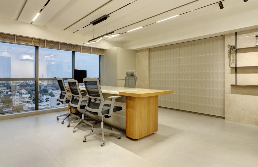
The layout follows the concept of parallel lines with its workstations, ceiling design and lighting layout which visually makes the space feel longer and grander. These parallel lines are then repeated in the design details of the furniture. In a small office space it becomes crucial to create a design element which can become the center of attention. The long wall running through the site became this element, the wall of fame so to say. This wall was designed so as to make it the backdrop against which the work desks are placed. The parallel lines intersect here to form a grid pattern on the paneling interposed with a shelving unit following the same grid. The paneling has beautiful mirror inserts which reflect the space partially creating interesting illusions.
Since the office needed only 3 people working at all times, we wanted to give spacious desk space with a possibility of entertaining visitors. The alcove was made into a perfect space to accommodate the accountant’s desk and the large storage that he needed.


A partition designed along the same grid pattern provides a certain extent of privacy between the Accounts department & the Director’s Table while providing ample surface to display arte facts. This partition also blocks the direct view of the Director’s desk from the entrance. Another partition blocks the pantry and the washroom from direct view. As a personal preference, we like to add color / colors, even if just a little bit to an otherwise monochromatic shell. Blue was chosen as the pop up color here and used in the storage and the shelving to contrast the muted greys, and the warm wood. A balance of color, textures, scale and proportions is extremely important to bring together a cohesively designed space.


To balance out the busy paneling backdrop, the opposite long wall has been painted in a grey concrete finish devoid of any trimmings. A minimal TV unit and a foldable table for the office boy are the only 2 things mounted on the wall. This long grey wall becomes the backdrop for 2 gorgeous Keaton chairs from Urban Ladder.


We had to be clever in our design as we wanted to create a fluid and functional milieu within a small office space. The false ceiling was kept all white and simple barring a black slit running across the length guiding the eyes to the far deep end. A small and quaint office space needed equally calming art, and a Buddha portrait painted by Usha Shah of Twilight – The Art Studio perfectly complemented the feel of the space.


A dream for any fan of minimalist design, this compact office design tested our knowledge of spatial understanding in smaller spaces and allowed us to create simple and streamlined furniture which kept the interiors bright and uncluttered. In addition to bigger offices, we love to design smaller spaces that makes one feel warm and gives a more pleasant and unpretentious vibe.
FACT FILE :
Project Name : Meta Office
Design Studio Name : The Design Chapel
Principal Designer : Preshita Shah Gupta
Client’s Name : Mr. Dinesh MehtaDesign Team : Preshita Shah Gupta, Kajal Kamath and Dhvani Parekh
Project Location : Mumbai, India
Carpet Area : 300 sq. ft
Project Year : November 2019
Photography Credits : Biju Gopal, Bizou Photos
Text Credits : Preshita Shah Gupta


