Schmitten Chocolates Store | Studio Renao | Surat
After successfully making a dent in the world of chocolates, Schmitten decided to venture into experiential cafes to cater to the long-distance travellers on the highway.


Ms. Mausam Desai (daughter of the director of Rajhans Group) had a very clear vision about how she wanted to the outlet to be like – something that stimulates all the senses, more particularly, the sense of taste, smell and sights, and leaves the customers with a memorable experience.


One of the peculiar design challenges we encountered was the high-tension line passing through our site. This meant building a structure 35 ft away from it, thus preventing us from building a road-facing Cafe. Undeterred by this, we instead resolved to create an iconic elevation that’s sure to grab the passers-by attention. The elevation was designed giving due importance to the existing outlet making the protrusion the hero element. Furthermore, the new structure was designed with modern and clean lines to balance the overall look.However, merging this with the existing structure of the chocolate outlet was another arduous task altogether.


With the new structure, we planned to incorporate elements that would give the cafe a more holistic appeal. We designed sections such as a comfortable seating area for the cafeteria, a bakery counter for freshly baked goodies, a bar area for chocolate-beverages and a separate merchandise area for those who want to take a portion of the experience back home with them.


Once we had the overarching plan finalised, we started with the designing each zones while also maintaining a visual cohesiveness. The existing outlet too had it’s exteriors and interiors revamped.


We positioned the front facade in a way that gave the customer the choice to enjoy their short OR long halt in their journey. Upon entrance, the billing counter is the first zone the customer comes across where the cashiers act as pseudo-receptionists to give a welcoming feel to the cafe. In order to convey the difference in sections throughout the cafe, we used levels in flooring – signaling a demarcation between the billing area, chocolate display section on it’s right and the cafeteria section on the left.


The chocolate display section was perhaps the easiest to design since the amount of chocolates already took care of this section’s attractiveness. We made sure to incorporate different displays such as wall shelves, chocolate pods, gifting section, to make chocolate shopping more interactive and fun.


The merchandise display section has been designed in the shape of Schmitten Chocolates to make the overall appeal more playful.


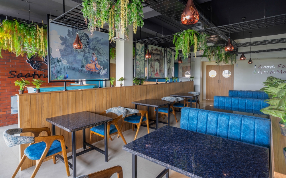
The cafeteria section on the other hand, had many more elements to it. Here, we used the sense of smell and sight as key sensory stimulators. The seating area adds a colour pop to the interiors. With its vibrant colours and access to panoramic view of the outdoors, it’s a perfect place to unwind and enjoy the baked snacks and chocolate drinks.


The bar, with its dark coloured elements gives a feel of the rich texture of chocolates used to prepare the drinks served.


The last and one of our favourite spots is the bakery area. The large windows, the scenes beyond and a slice of cake is the perfect companion to charge you up for the journey ahead and of course our doodle wall is the ideal spot to click selfies and take back memories.


FACT FILE
Project Name : Schmitten Chocolates
Design Firm : Studio Renao
Principal Designers : Zinal Mehta, Rajvi Mangukiya
Project Location : Surat
Styled by : Uplifting Depictions
Photos credit : Prachi Khasgiwala Photography


