Shibui Office | The Design Chapel | Mumbai
Tadao Ando believed that the way people live and operate can be directed a little by design. As Interior Designers we have a moral responsibility to add value and meaning to an empty shell. The essence of our work will always be about people and how they can operate with ease and joy in a space. Human centered approach to design encourages us to tame complexity and make the final result simple. This was precisely the principle based on which we approached the design and execution of this office project.


With a rectangular shell of 400 sqft and ceiling height of 10’6”, we differentiated the space into 3 parts depending on the functions to be accommodated. While still allowing the parts to visually flow into each other and hence giving a sense of expanse. The 1st part near the entrance accommodated the meeting room, the 2nd part became the central workspace and the last part was set for the Director’s and the Manager’s work desks. The large window at the smaller end of the site allowed in ample amount of light and became our favorite quality in the space.


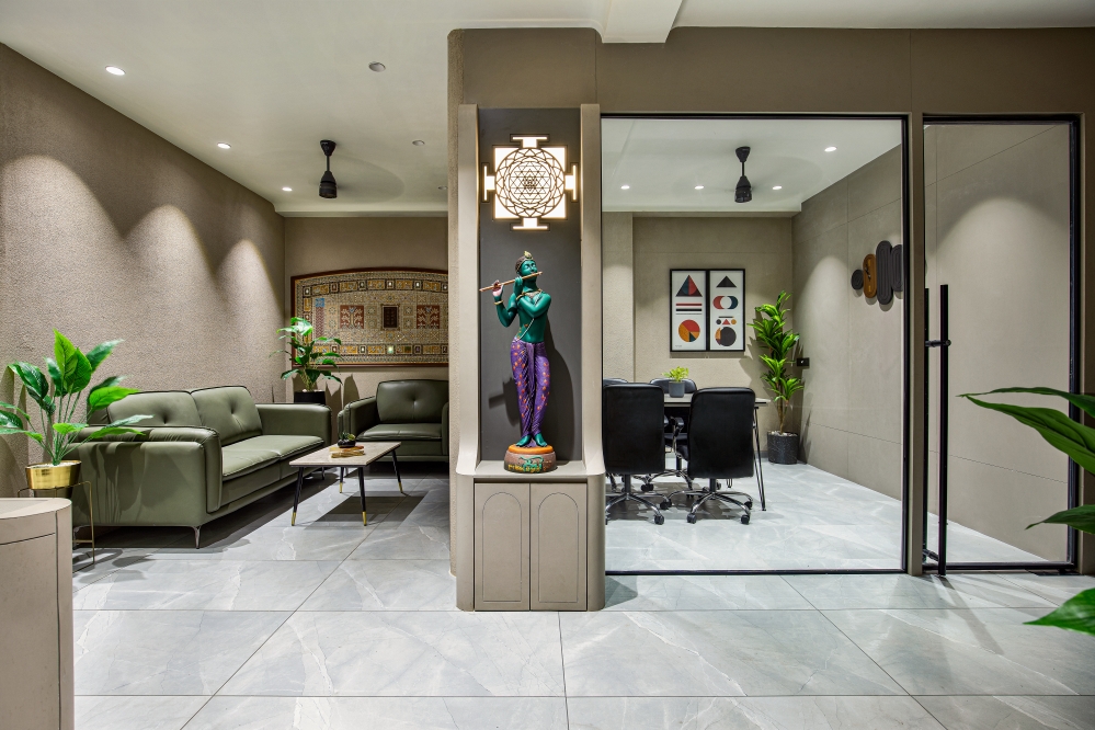
The meeting room was conceptualized as a glass box in an otherwise unabridged space. The wooden ceiling with a light cove running on the its edge made this the box stand on its own where as the glass partitions allowed visual transparency while maintaining a certain level of privacy. Dark ash wooden flooring flowing through the entire office creates a level of homogeneity tying the whole as one. In order to make a smaller area look more expansive, we narrowed down to a monochrome color scheme. The entire canvas of the site has neutral shades of grey, pine wood and dark ash. The grey and pine wood balance each other and create a beautiful synergy. Each complements the other and neither overpowers.


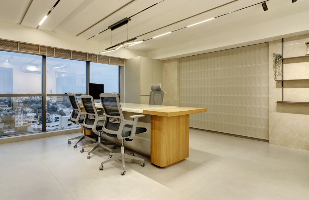
Placing a high table with bar stools at the center created a circular movement trail around it with peripheral work desks and continuous storage above making the space more capacious. This central desk became a place to take a break, have lunch or even work while standing. The work desks pushed against the walls keep the central space free for movement. They are designed keeping in mind minimum requirements of the employees so as not to add more clutter. Less visual clutter leads to less mental clutter was our motto here. The storage and functional units are all planned meticulously and are governed by ease of maintenance. The furniture is designed in a grid with an intentional play of grooves to minimize material wastage.


Towards the end of the office was a small washroom, outside of which we created a functional pantry mimicking the work desk design, but differentiated from the latter by a custom design pine wood screen.


The concept was to create an easy on maintenance work environment with an infusion of some glamour and luxury. As a result meticulously custom designed light fixtures in gold body by Lightscapes were added and made to enjoy their moment in their own spotlight. The circular glass lights floating in the space added a touch of drama which we welcomed. The intent was to have an elegant interior, rich in modern luxe charm with keen detailing. With ample amount of natural light coming in the office space became more informal, airy, inviting and creative.


We did strive for two things in design, simplicity and clarity, both in thought and execution with an aim to balance function with some amazing quality and great design.
FACT FILE
Project Name : Shibui Office
Studio Name : The Design Chapel
Principal Designer : Preshita Shah GuptaClient’s Name : Mr. Ajay Anjaria
Design Team : Preshita Shah Gupta, Kajal Kamath and Simran Agarwal
Project Location : Mumbai, India
Carpet Area : 400 Sq. Ft.
Project year : January 2020
Photography Credits : Biju Gopal, Bizou Photos
Text : Preshita Shah Gupta


