Atlas Office | The Design Chapel | Mumbai
Having a design practice based out of a metropolis like Mumbai, means designing for extremely small and tight spaces. Where every sq ft of area comes at a high price, the onus falls on the designer to make sure each inch is used well. We decided early on as a studio not to allow smaller spaces bear the brunt of bad designing. With this 300 sq ft office space, we developed a design which optimized the limited floor space while still maintaining openness.


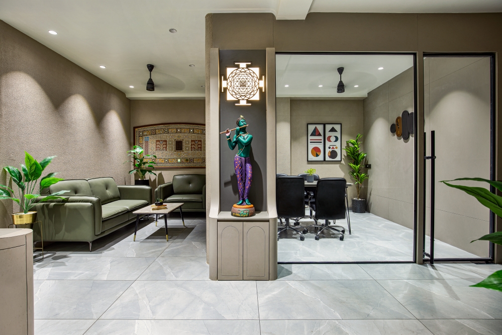
We offered what the site demanded, nothing less nothing more and decided to construct only what was needed without engaging in any cosmetic layers. The planning was starkly simple. The floor plan is a rectangle with the entry at one small end and a large window at the other. This made us differentiate the space into 3 zones, which flow into each other. The entrance leads to a small passage which is flanked by a meeting room. Then comes the common workspace followed by the Director’s work desk. The aluminum and glass partitions of the meeting room allow visual transparency while maintaining a certain level of privacy.


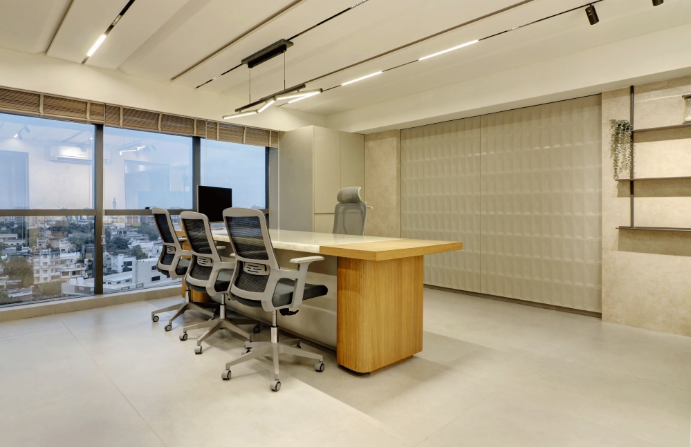
The work desks are then pushed against the walls to keep the central space free for movement. They are designed to be simple and uncluttered. Once we did this it was important to add character to the side walls so that the employees are not staring at blank canvases while working. The Venetian skyline fabric from Furnista was chosen for the soft board with light coming from the top making sure the work desks are well lit. The storage and functional units are all planned meticulously and are governed by ease of maintenance.


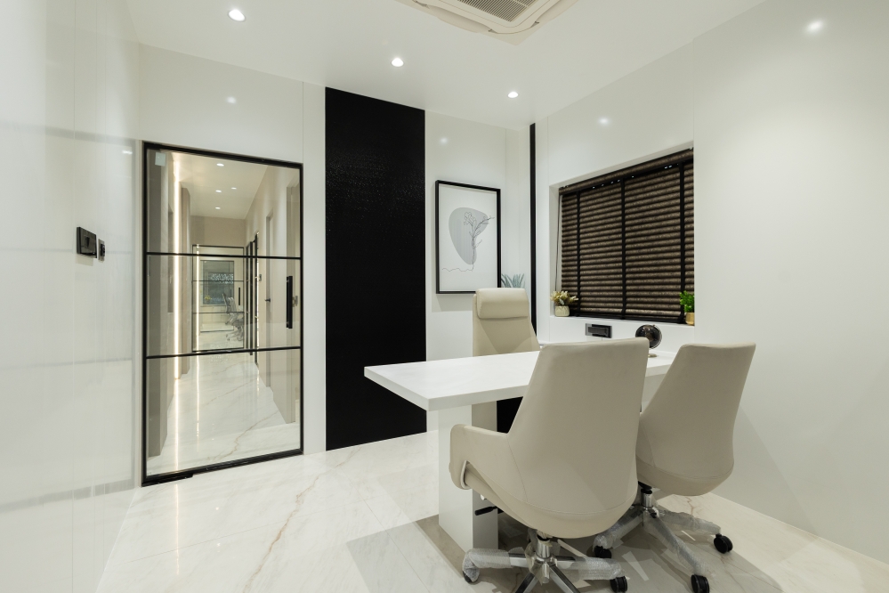
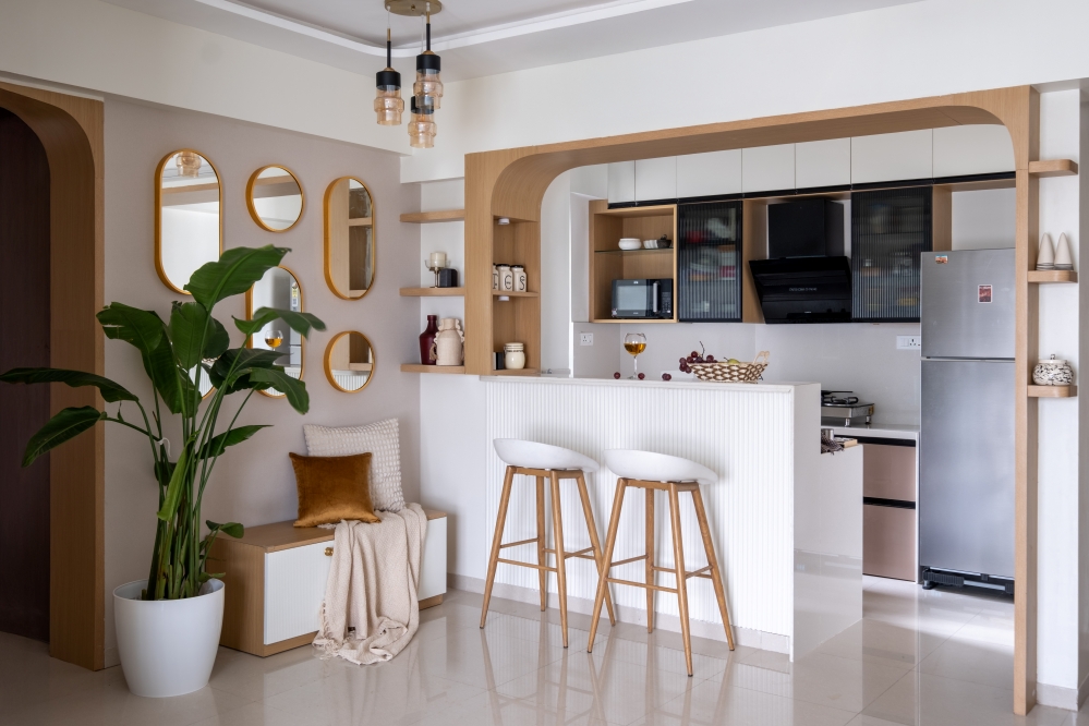
Towards the end of the office was a small washroom, outside of which we created a functional pantry mimicking the work desk design, so that it blends in. The space beside the washroom created an ideal spot for the Director’s workstation. The ceiling height of 11 feet allowed us to create a loft space for storage above this workstation bringing down the scale of the space and creating a more intimate and cozy corner for the Director’s work area. We used this as an effective tool to add more storage space as well as creating a small sub space in the larger whole.


In order to make a smaller space look more expansive, we narrowed down to a monochrome colour scheme. Muted greys, deep warm wood and white statuario marble laminate became the material palette. The grey wood flooring flows through the entire office granting the illusion of a seamless space. The fluted teak wood panels along with rough white marble laminate used on all the storage units created an interesting play of textures. Here white and wood balance each other and create a beautiful synergy. Each complements the other and neither overpowers.


The element of light was very important to us and we allowed ample amount of light to flow through and reflect through the single window at the end of the office. But artificial lighting plays an equally important role in office spaces. Here we chose accent light fixtures from Lightscapes to add glamour and luxury to the otherwise subdued spatial aesthetics. The gold of the light fixtures become focal elements of the meeting room and the central office space adding drama. Color is added to the muted grey walls by integrating the artwork by the Twilight Art Studio which stunningly complements the contemporary feel of the office.


When it comes to designing an office, the comfort of employees is of utmost importance for us. The employees being the backbone of any organization, we believe that cramped offices, gloomy designs and unimaginative desk spaces only add to employee frustration and hamper productivity. We have encouraged lack of fuss with open, clean interiors which one will not grow tired of. Following the mantra of ‘Less is More’ we managed to make the space look less cluttered and visually more relaxing.
FACT FILE
Project Name : Atlas Office
Design Studio : The Design Chapel
Principal Designer : Preshita Shah Gupta
Design Team : Preshita Shah Gupta, Kajal Kamath and Simran Agarwal
Client’s Name : Mr. Atul Anjaria
Project Location : Mumbai, India
Carpet Area : 300 Sq.Ft.
Project Year : February 2020
Photography Credits : Biju Gopal, Bizou Photos
Text Credits : Preshita Shah Gupta


