The Bay Residence | The Design Chapel | Parel, Mumbai
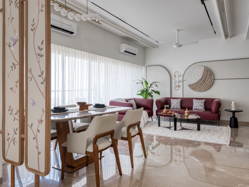
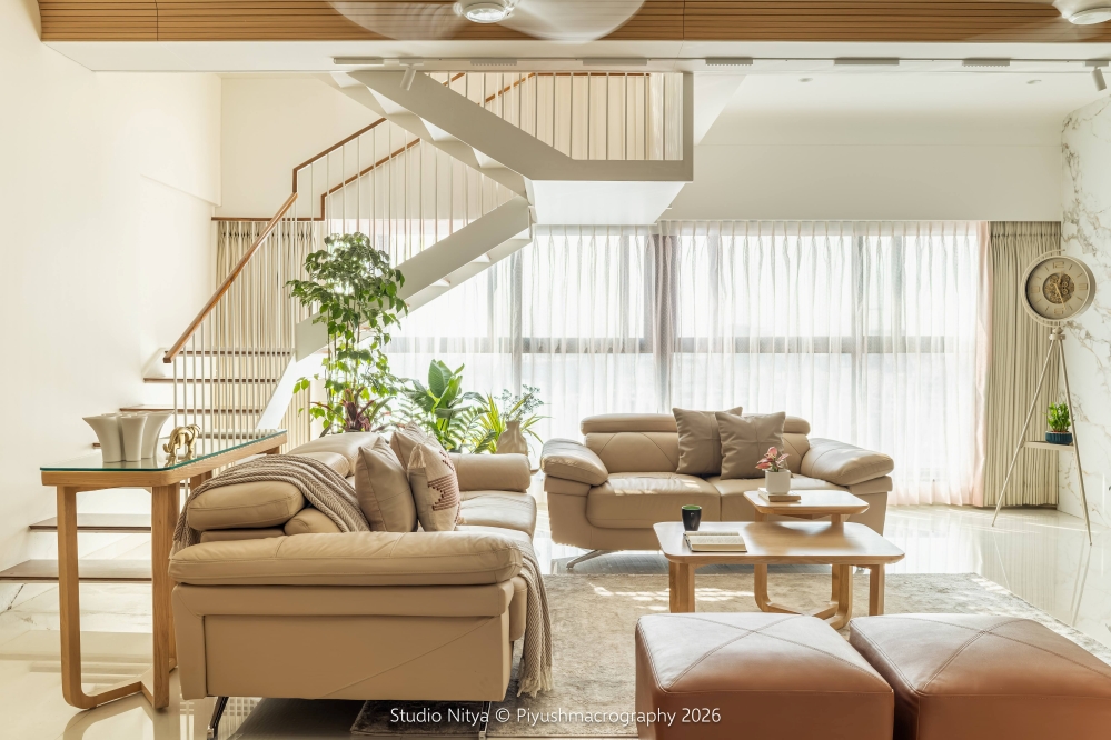
The moment I walked through the entrance passage of this empty 4BHK house into the spacious living and dining space I was overwhelmed by the lightness that engulfed me. The full length glass sliding doors allowed an enormous amount of light that spread like a bright blanket over the whole space. The glass doors led to a massive balcony which then presented breath taking views of the sea beyond. The infinite horizon extending our vision added to this sense of weightlessness. Each room possessed these balconies and visually extended the space allowing handsome amounts of light to rush through. I had decided then and there to keep the interior interventions minimal, understated and subtle. Our design intercessions were all planned with the intent of allowing the light to be the hero.

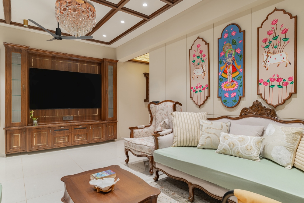
Our first step in the design process is always to listen carefully to our client’s brief and requirements and imbibe their aspirations, fondness and expectations for their house. Designing for a Bohri Muslim family made me dwell into the interior elements of traditional Bohri homes in Patan, Gujarat. We took elemental inspiration in terms of their carved furniture especially for the master bedroom since the seniors really wanted that connection with their past. The younger generation wanted a more minimal and contemporary take on their past, which made me take stimuli from the colours and wallpapers used then. We realised that the walls in traditional Bohri homes were beautifully cladded with printed wall paper, they had mouldings on walls and exquisitely carved furniture with a soothing pastel colour scheme on the exteriors of the houses which make these Patan streets instagram worthy. These elements were then translated and given a contemporary facelift while being mindful of employing subtlety. Having a precise concept helps us a lot in deciding the path in which our design elements ought to follow.


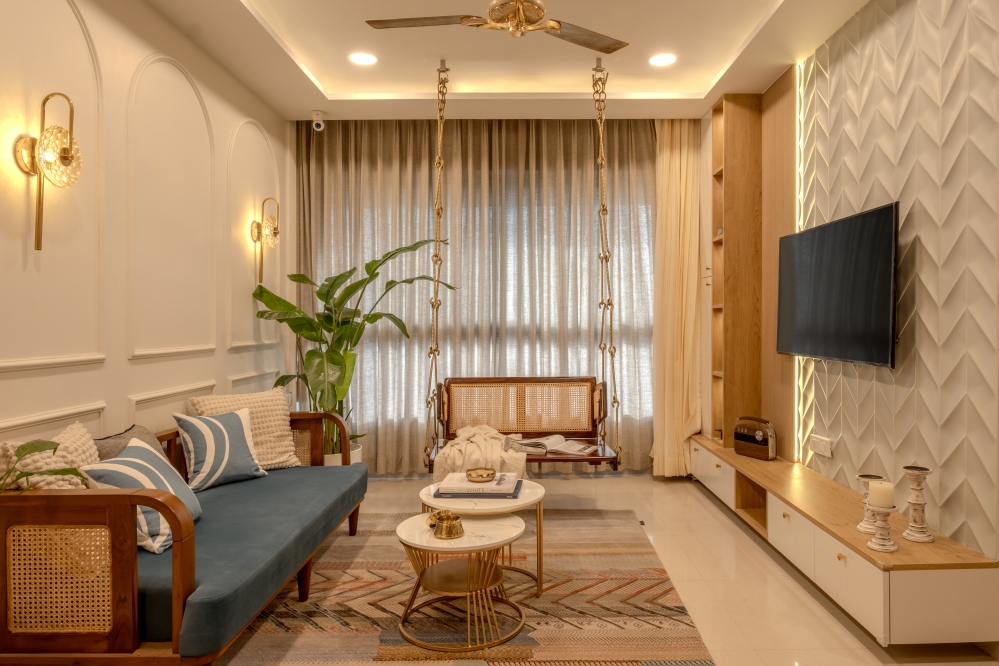
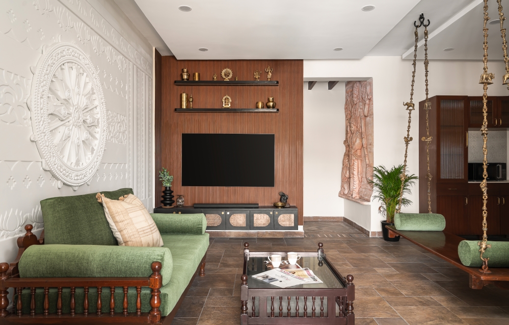
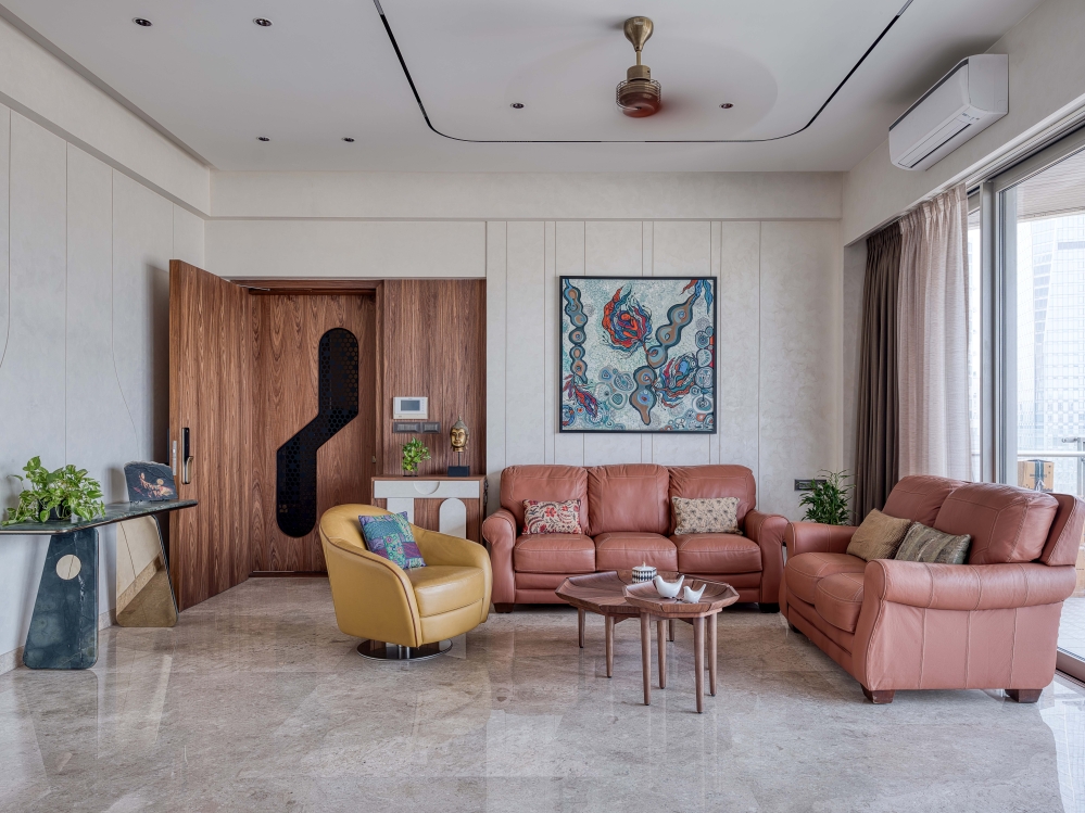
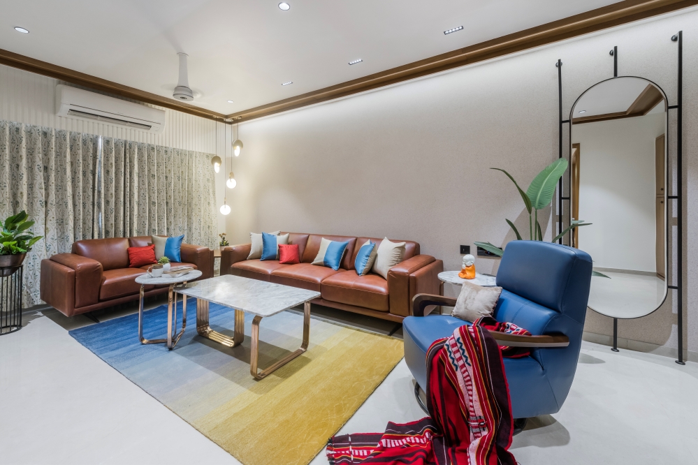
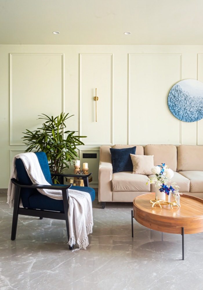
The living room has been kept extremely modest and bare allowing it to look more spacious. We at the studio also believe that every object and space is a reflection of its environment and its people. The people living in this house are simple and large hearted and we wanted that to reflect in the living room. The gold and crystal chandeliers and the console table are the bespoke elements that add all the drama to the otherwise paired back aesthetic. Glimmers of laid back luxury peep through in the marble television unit and the potpourri of gilded accents.


The specific requirements and liking of each family member were pretty distinct. Along with this, there was an extremely strict and limited time of 3.5 months given to us for the entire designing and execution. These varied briefs and a rigorous time line from the clients kept us on our feet and provided a lot of challenges which we were through sheer perseverance able to overcome.


The vast balcony is where the clients start their day. The swing offering views of the Arabian sea at sunset provides a respite from the daily chaos that Mumbai is and it is here that they feel the true bliss of their new abode.

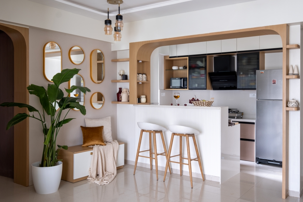
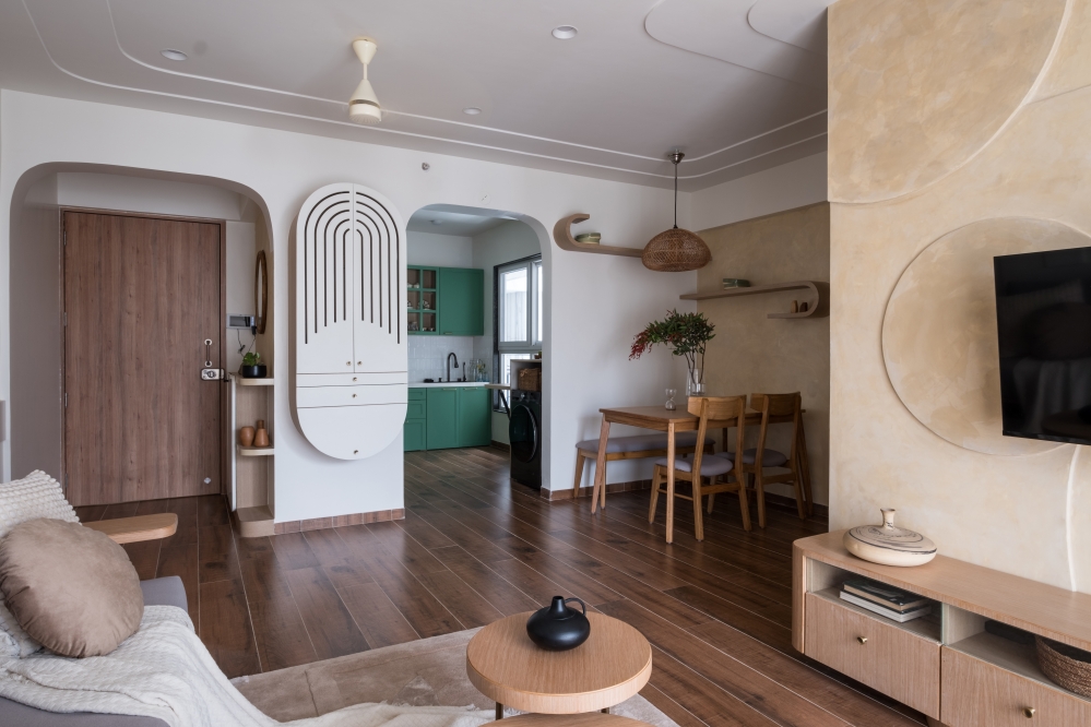
The kitchen in all white was the only space not really getting any large amounts of natural light. So we decided to make a window between the dining and the kitchen allowing light as well as conversations through it. The arched sliding door of the kitchen is echoed in the mirror panel opposite on the entrance passage flanked by a lounger on one side and a console on the other.


For the Master Bedroom, we decided to go for mango wood carved furniture as a continuation of their past legacies but finished them in a pastel mint green PU coating as a homage to the inclusion of pastels in the colour scheme. The bed back wall is panelled with a grid of wooden battens, replicating older ceilings in traditional homes and painted in grey which makes it a perfect base for the mint green to pop. Wooden rafters on the ceiling mimic the shade of the wooden flooring and the Persian rug, the wallpaper, the vintage art on the walls along with a crystal chandelier complements the concept of unassuming continued tradition.


The guest bedroom was given this air of understated luxury as the family entertains a lot and wanted to give their guests a stay that would encourage them to visit often. The moulding panel on the lower half of the bed back wall painted in a rich coffee colour complements the rose gold wallpaper with creepers, flowers, birds and lanterns. These muted shades allow the bright orange of the bed back to stand out. These elements add instant character and personality to the bare shell of the room. The rest of the furniture was designed to take a back seat and merge with the surroundings. The curtains, light fixtures, art and the soft furnishings were chosen while allowing the bed back wall to be the star of the show.


The daughter wanted a pink bedroom in a way that does not make it look too young for her age. A mature pink bedroom is what we aimed at. The floral wallpaper and the mouldings helped in maintaining the traditional continuity while the arched bed back along with the arched sliding doors to the walk in wardrobe area brought in the modernity. The elemental additions were again kept minimal while letting functionality reign and the furniture was all finished in white to allow the sweeping light reflect and make the space look bigger and brighter.


The son’s room presented the opportunity to custom design furniture elements keeping the functional as well as aesthetic demands in mind. Simplicity reigns supreme in this space. But then isn’t simplicity all about subtracting the evident and adding the meaningful. The space is kept rather monochrome with just a pop of a vibrant blue. The exposed white brick wall with art from Calcuttan gallery was enough to allow the furniture pieces take centre stage. The walk in wardrobe is separated with a flute glass black bodied sliding door. Pushing these sliding doors away reveals very prudently designed wardrobe shitters with a full length mirror and a dresser unit. The study unit mimics the simplicity of form and colours. This room is rather defined by careful design details, bold scale and a crisp colour palate.


We at The Design Chapel believe in working on concepts that belong to the land and its people. This strengthens our belief that context and environment influence people, their thoughts, aspirations as well as their spaces and objects. We received immense joy in merging different design sensibilities picked up over the years to bring the best visually bold and cohesive design solutions. We hope we are able to make our designs timeless and holistic and continue on this journey or rediscovering our design ethos.


FACT FILE
Project Name : The Bay Residence
Design Studio : The Design Chapel
Principal Designer : Preshita Shah Gupta
Design Team : Preshita Shah Gupta, Kajal Kamath, Anjali Khandelwal, Tanvi Kirve
Client’s Name : Mr Khuzema Sohragpurwala and family
Project Location : Parel, Mumbai, India
Carpet Area : 2500 Sq. Ft.
Photography Credits : Bizou Photos | Biju Gopal
Project Styling : Pistyle
Text Credits : Preshita Shah Gupta
See Full Project Video >> @interiorlover.in


