#PriVi House | The Design Chapel | Mumbai
I would like to start with this quote by Alain De Botton in The Architecture of Happiness, “Belief in the significance of Architecture is premised on the notion that we are, for better or for worse, different people in different places. And it relies on the conviction that it is architecture’s task to render vivid to us who we might ideally be.” Does your home then become a guardian of your identity? This leads to the question whether your space must reflect your identity or whether a sensitively designed space creates an impact on a person’s behaviour thus crafting parts of his self.

We believe both hold true. The client for this project is an ever smiling, ever positive, kind and an extremely accommodating couple. Their cheerfulness, love for humour and zest for life gets translated into a home which is sprinkled with colours and prints balanced with calming neutrals. Their likes and dislikes, their talent and aspirations gets form in the art, artefacts and accessories for the house. These objects can say as much about the individual preferences of the owner as about the designer’s own personal style and thus the space influences the inhabitants and vice versa.


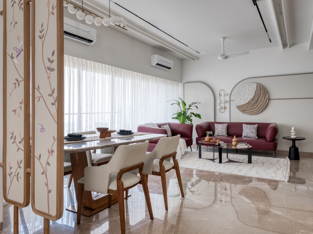
The living room has been designed to give evidence of a certain kind of happiness to which I feel our design has made its distinctive contribution. The living room is a medley of colour and patterns. Our love for both gets exemplified in the beautiful tropical wallpaper with palm trees and parrots from Kaalalarihath which is the piece de resistance as the backdrop of the dining table.

The blue of the sofa and the dining chairs is balanced with the black and white geometric rug and the pop of pattern is added by the high back chair in greens and yellows. The royal blue sofa is a colour that the clients can love and live with for a long period of time. The cushions in beige with green palm accents mimic the wallpaper. The custom designed furniture is all kept muted in shades of greys, wood and black to provide a neutral base for the vibrant colours and prints.


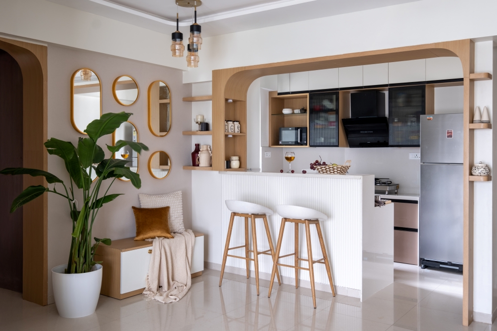
In Mumbai flats where the kitchen is placed at the entrance, it becomes immensely important to cordon off the space with a sliding glass door for privacy. We wanted the light coming through the large window in the kitchen to reflect and multiply. Hence the kitchen cabinetry was kept in a muted eggshell colour. We added the colour and character through the kitchen dado in a hexagonal pattern of white and blue strips celebrating the simplicity in design.


In the master bedroom, the pastel green on the panelling and the wardrobes straddles the gap between warm and cool colours. Itself a cool hue, it harmonizes with the warm pink and the deep blue of the bed back making the space feel rich and cosy. The interesting mix of arches on the wardrobe door and floral pattern of the wallpaper complement the wood and the grey base of the master bedroom. The wallpaper, the art on the walls and cushions become such poignant tools here for adding pattern and character.


Blues and greens with white are such a classic combination, yet they never fail to look clean and refreshing. For the home office / chill room we tried to juxtapose stripes and checks of varied scale to provide a contrast with the plain walls. The floral high back chair helps to soften the regimented effect of these checks and the stripes.


The checker wallpaper from Nilaya is just a classic when it comes to the pattern world and when used in blue and white they feel so easy on the eyes. The bright blue wood carved leg of the study table is a little addition of our much loved detail. Rest of the furniture stays in the background to allow the airplanes, rockets, pilots and other space collectibles of the clients to shine.


In the guest bedroom, the palest tones of beige and blue create a soothing and comfortable atmosphere which then paired with knitted throws and block printed fabrics add a hint of warmth and subtlety. The soothing blue makes up the bed back wall framed with mouldings and a girl laughing in glee. This piece is what the eyes get drawn to and it is supported by the beige and contrasted by the deep charcoal grey of the wardrobe.


Pattern is added in the wallpaper framed by an arch and dotted with a deep sage green art piece. This space flanked by greens becomes a corner to unwind, relax and contemplate. The simple designs of the dresser, wardrobes, bed and side table sit well with the calming energy of this room.


Some of the pieces of furniture like the console unit, the bar unit, the dining table and the study table are designed with a lot of thought put into combining materials like flute boards, terrazzo and teak wood with the basic elements like plywood and laminates. A great amount of thought has been put in the accessories and works of art to add the client’s unique personal style to the entire house.

We at The Design Chapel want to design as per the influences of the client’s surroundings. A space where the best parts of us are offered the opportunity to flourish. It is this power that a sensitively designed space can possess that made us become architects of interior spaces.
Designing houses and converting 4 walls, a floor and a ceiling into a home is a thing of great beauty and joy. It is this satisfaction that attracts us to the immense power design has for transformation. A house becomes a home when it not only provides physical but psychological sanctuary too. We strive to achieve this precise balance.
FACT FILE
Project Name : #PriVi House
Design Firm : The Design Chapel
Principal Designer : Preshita Shah Gupta
Design Team : Preshita Shah Gupta, Kajal Kamath, Anjali Khandelwal, Tanvi Kirve
Client’s Name : Vivek Hegde and Priyanka Sukhtankar
Project Location : Powai, Mumbai, India
Carpet Area : 1100 Sq. Ft.
Photography Credits : Anuja Kambli
Interior Styling : Preshita Shah Gupta
Text Credits : Preshita Shah Gupta


