Paul Mansion | Tatvam Concepts | Calcutta
Client Brief
The clients have been living in the house since decades. They wanted a decluttered and spacious layout. They are a family of four and were eager to convert one of the 4 bedrooms into a Den, the primary purpose of which was to entertain guests. Incorporating a powder bathroom was also necessary. They left everything else up to us!

Our project, Paul Mansion is a colonial era building in the heart of the city, a striking reminder of a Calcutta that served Capital to British India for a long time. The renovation of this 19th century Victorian home, presents many beautiful details, preserved charm, and thoughtful design. The premises typically had red oxide stone floors, voluminous rooms, slatted Venetian painted windows, horizontal wooden bars to lock doors, open balcony, patterned cast-iron.

The primary goal was to create a cozy and relaxing domestic environment that would transform the home into a moment of calm – a restorative space for relaxing and recharging. Indeed, the interior is dominated by calming color tones, natural materials and soft lines. We retained the tall ceilings and teak wood windows that brought back the original glory of the past.

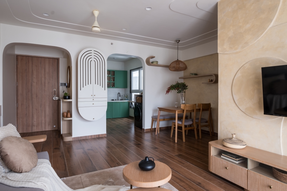
This apartment has a living and dining area, a powder bathroom, 3 bedrooms ,1 Den, a kitchen and a balcony that joins two of the bedrooms. Our approach was focused on keeping the common areas connected to offer flexible spatial configurations.


As you enter into the Foyer, you see a beautiful biophilic wallpaper that immediately brings freshness and an element of nature in the home. The floor to ceiling wooden swivel door was used as a divider to separate the foyer and living room, while still maintaining the feeling of openness.


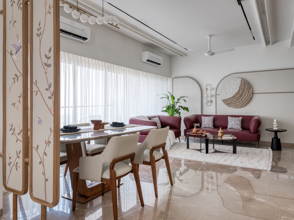
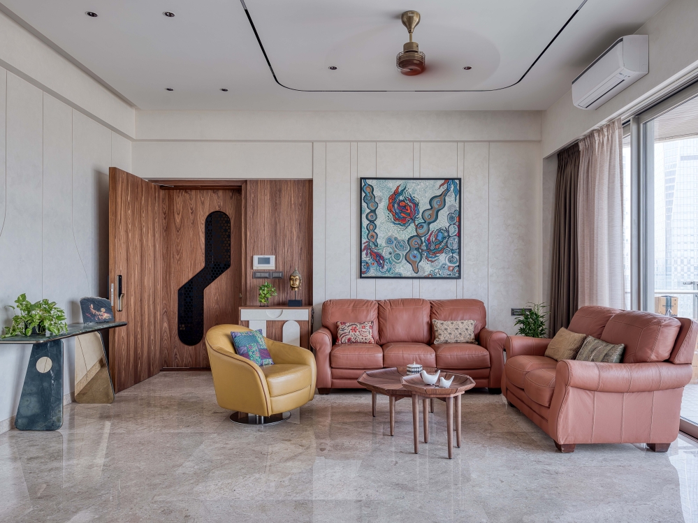
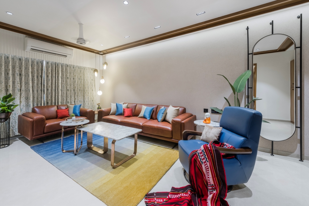
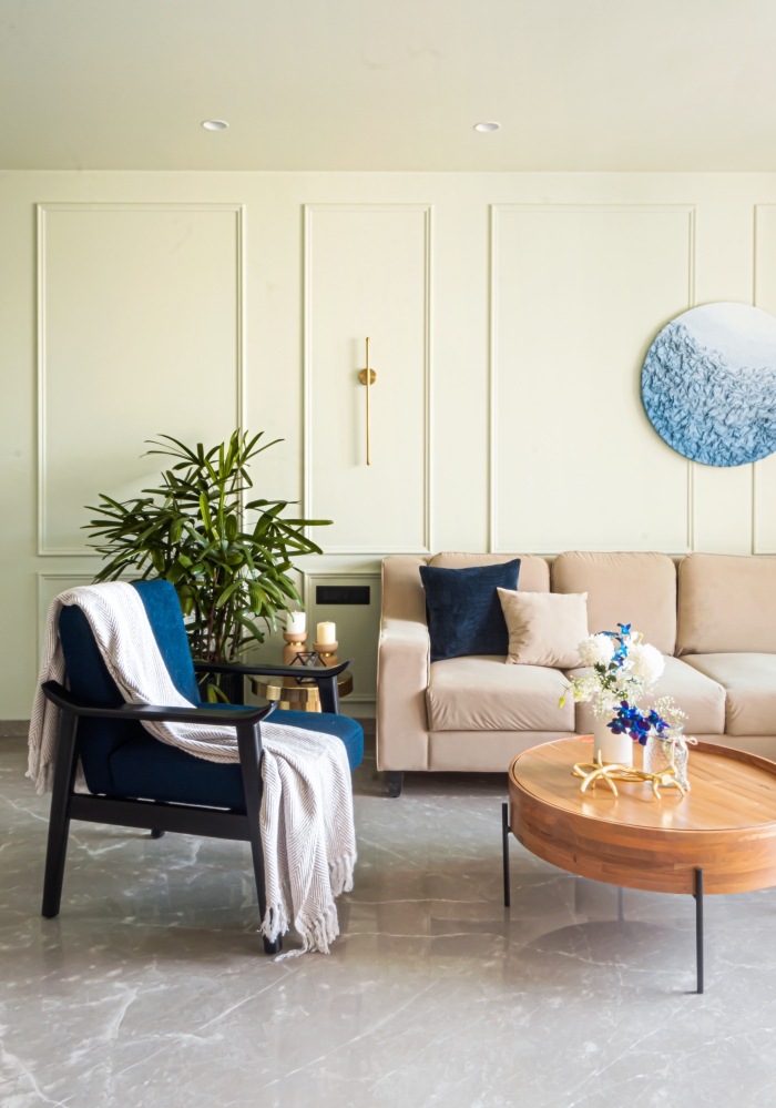
As we enter the Living Room, we see a continuous layered panel, that has 2 hidden doors! One that opens up to a sophisticated neo classical powder bathroom, and the other to the Master Bedroom. (The powder bathroom area was scooped out from the grandmother’s bathroom). We infused plenty of seating in the living area keeping in mind their entertaining needs. Upholstered sofas and olive green armchairs were set against a marble clad wall. The large jasmine silk black and white rug binds together all the furniture in the conversation area.

The focal point is the hand painted image of a King of Spades – painted on the sliding door that opens up to the Den. This art was specially chosen to reflect the client’s personality and his personal entertainment space.


This partition acts as a two way as to keep the den room private when required and can also help the den room act as a larger gathering space when kept open. It is steeped in shades of bottle green exhibiting a raw chic neutral vibe. A visual contrast between finished and unfinished walls with exposed bricks and the herringbone flooring beautifully compliments the setting.

The Dining Table stands out with an unusual and organic shape. The earthy tones of the dining chairs and Italian marble further add a delightful naturalness.


The Master Bedroom captures the idea of livable elegance, with its pops of blue and it’s clean and cozy vibe. We have used wooden flooring and a floor rug to match the color tone of the accent armchairs. A bookshelf breaks the monotony of the hidden storage behind the upholstered bed.


The Master Bathroom is nothing but grand. The floor to ceiling height beveled mirror, adds more depth to the already enormous bathroom. The black tiled flooring neatly separates the wet and dry areas. The smokey pendant lights and the brushed bronze fittings add a sense of luxury and opulence.


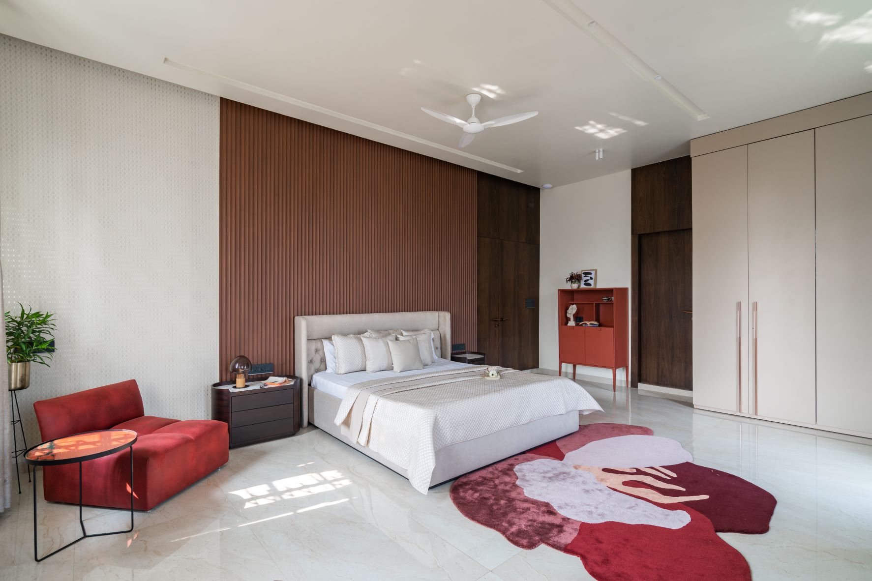
The Grandmother’s room leans more towards minimalism. The color palette brings a sense of calm and serenity to this bedroom. The upholstered luxury headboard creates a contrast with the walnut panels. For visual interest, we incorporated subtle patterns in the wallpaper, pillows, and a rug that is the highlight of the room. Few plants and décor items keep the room décor crisp and minimal.


The Son’s bedroom features a popular neo classical backdrop as a timeless aesthetic with unique contemporary touches to it. Blue and tan – which are complimentary colors are intentionally used in areas that visually draw the whole room together. The chesterfield arm chair, David painting and the moldings on the wall add a neoclassical touch to it, while the stone veneer behind the TV and the black tinted wardrobe, keep the room feeling young and fresh.


The 40 sq. ft. bathroom was a challenging space. Using light colors to make the space look bigger would have been the obvious choice. But we decided to use black. Bold and dramatic.

The 250 sq ft Balcony, whichthe clients wanted to be a calming and relaxing area, was converted into a lush carefully manicured and landscaped lawn.

Our mandate was to create a sophisticated, light and airy home suitable for a young family that enjoys an active lifestyle, reorient the indoor living spaces to embrace the contemporary setting while respecting and restoring the heritage character of the house.

The past two years have taken a toll on our mental and physical health. It has taught us the value of our homes and the peace and tranquility that a cosy and functional home adds to our life. This apartment is a labour of love!
FACT FILE
Project Name : Paul Mansion
Design Firm : Tatvam Concepts
Principal Designer and Founder : Sakshi Arora Poddar
Design Team : Aritra Mitra, Ranjit Biswas
Project Duration : 8 months
Project Location : Culutta
Photography Credits : Inclined Studio
Products | Manufacturer
Rugs : House of Rugs
Furniture : Wzor Designs
Lights : Avenue 48


