Radhe Heights 3BHK | KK Design Studio | Ahmedabad
The Client was looking for a space that reflects the warmth of a home with a pinch of Comfort & Luxury. We have tried to achieve this by the use of raw wood and luxury materials in majority.

CORRIDOR AND LIVING ROOM
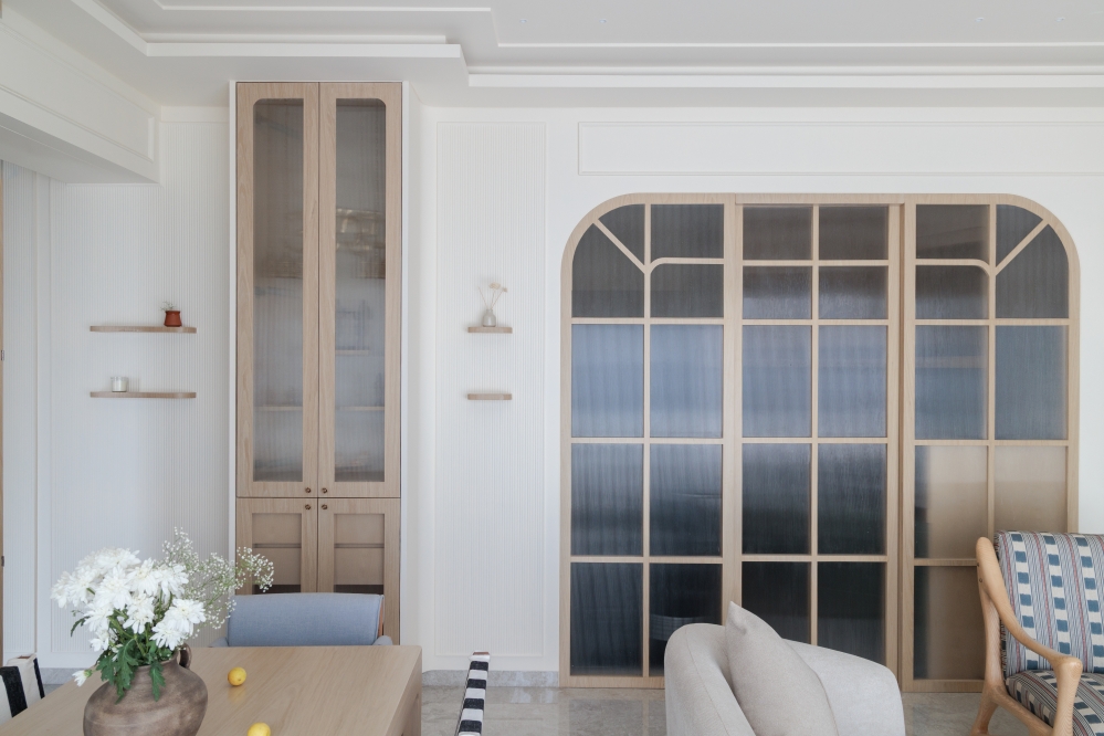
For example, there is a wood ceiling in the entrance. The main door of the house is designed quite aesthetically using curves with a hint of brass where brass represents luxury and the wood and combination of blue and white represent the warmth of the space. We have tried to combine the two elements to provide an outcome that suits the client and to make this space a home.

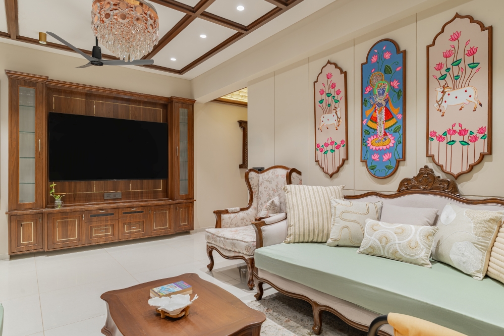
A short corridor leads you to the common living spaces. On the left, the corridor is combined with the colours and wood with a footwear cabinet that continues along with a beautiful tv unit without breaking any language. It smoothly takes you to the common area (living room).

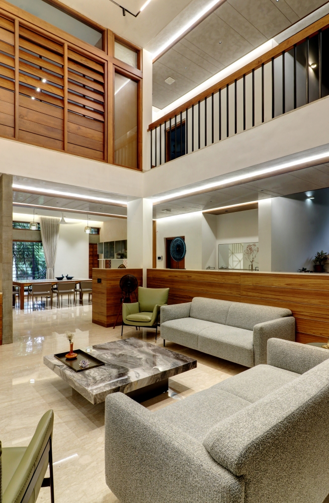
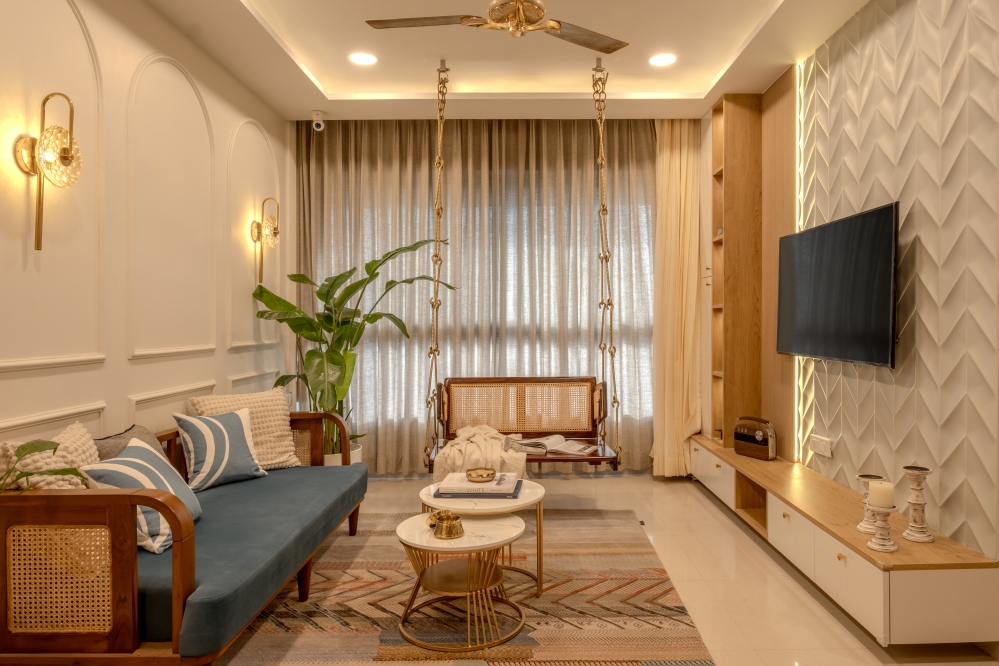
The unit is multifunctional in nature; it houses the Puja unit in it too. Continuing the mood created with the combination of neutrals and the colour of creativity, the living space is an open floor plan; it feels a very welcoming space with the attractive blue texture of the extraordinary sofa. Complementing with grey duen wall in the back and touch of wood detailing by the hand rest.


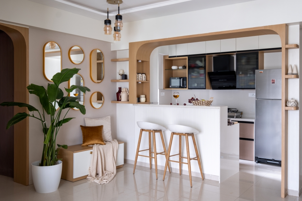
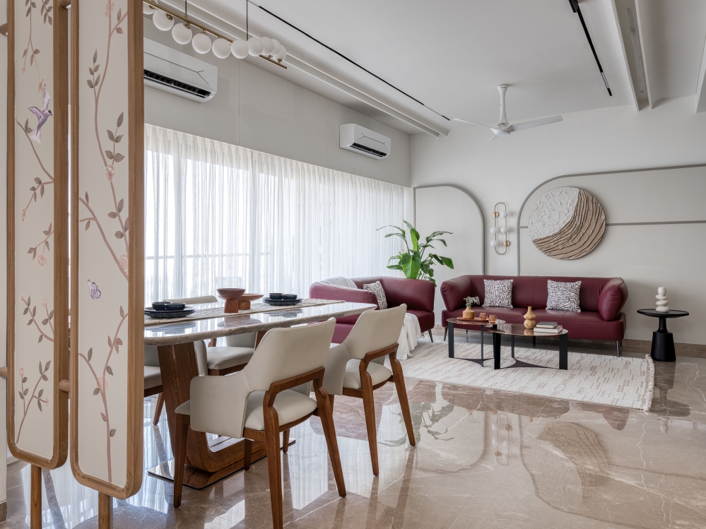
Being an open floor plan, the kitchen, dining and living spaces merge as one. We have tried to keep the essence of each space according to its function while also trying to keep the overall design language consistent across the spaces.


DINING AND KITCHEN
Moving forward towards dining space and kitchen area. The dining is not created like any other table, the table represents the togetherness of the family. The table is connected with the beautiful wooden flaps partition, from which the client can have a sneak peek into the living area or keep it close for the utmost privacy.


The kitchen and dining area has been kept an open space to create a harmony of the space. But to create a bit of diversion to separate the space language of different colours has been used, again going from neutrals in the kitchen creating that beautiful finish to the color of creativity in the dining area.


SON’S BEDROOM
The master bedroom and another bedroom lie at the end of the corridor. A private dressing cranny is created in the son’s bedroom using the wardrobe as a screen, and it also helped in providing a minimal look inside the bedroom. The theme of the house continues behind the wooden grooved screen.


First in the entrance of the son’s bedroom the picture gives you as there is only a bed and wooden screen connected with the minimal study table. The unique design of wardrobe is working as a multi functional element, being a walk in closet, connected with study and playing the role of TV unit. The colour and material palette are contrasting in nature. The colours are bright whereas the materials and textures have a subdued tonality to it. The balance is achieved by play.


MASTER BEDROOM
Master bedroom is created partly differently from an ordinary bedroom. Combining the materials and colours with a very neutral sense. The wardrobe and tv unit combine in a most unique way to create any differentiation.


Client cast lined in between of the ongoing project asked for extra sitting space and a minimal study of the dressing, providing solutions and fulfilling client’s needs and providing the needs in a most unique and sophisticated way possible.


FACT FILE
Project Name : Radhe Heights 3BHK
Design Firm : KK Design Studio
Principal Designer : Karan Khanchandani
Project Location : Ahmedabad, Gujarat
Photography Credits : Pixfix Studio


