Bianca Residence | The Design Chapel | Mumbai
Our brief from the clients for this project was to achieve a space that is calm and neutral, fresh and well lit, open and unrestricted in its function. We were approached to design a minimalist haven with elements that soothe and calm rather than excite and stimulate.
When it comes to typical Mumbai apartment layouts, the clients put forth two main requirements: one to make the space feel as large and visually expansive as possible and two to maximise storage space. We figured that with the use of the right materials, colours and elements we could create an illusion of expanse and spatial volume. Our task was to make the most of the floor space of this typical 2.5 bhk compartmentalised apartment with minimum turnover time and budget.

We started by stripping the house to its bare shell. The decision was to retain none its existing elements but to remodel the entire space as per the new brief. The home needed to make the occupants feel at ease. It was to be converted into a welcoming sanctuary. Our design team tried to represent and replicate the simplicity and peace we felt within the client’s own nature.

We explored minimal layering coupled with a play of understated materials. This created a controlled muted environment interspersed with colours, patterns and textures. The aim was to create a visual dichotomy across the space with the use of blues and greens, a plethora of patterns through wallpapers and tiles, textures through rattan and terrazzo alongside a calming neutral palate. The balancing act was important in this project.


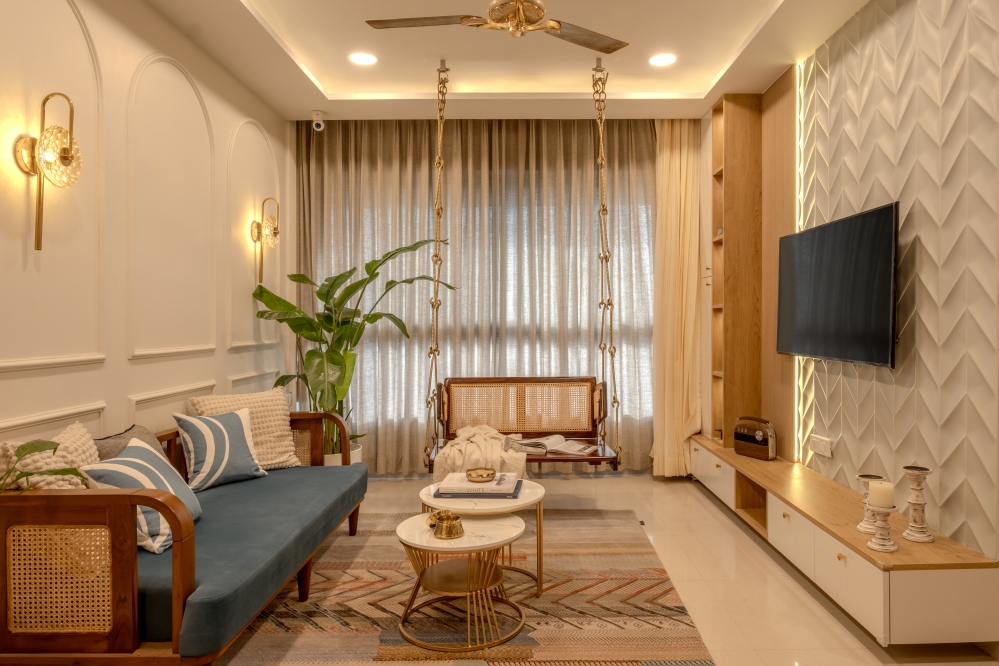
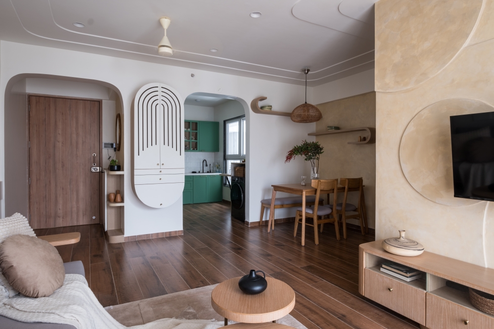
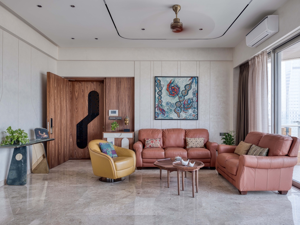
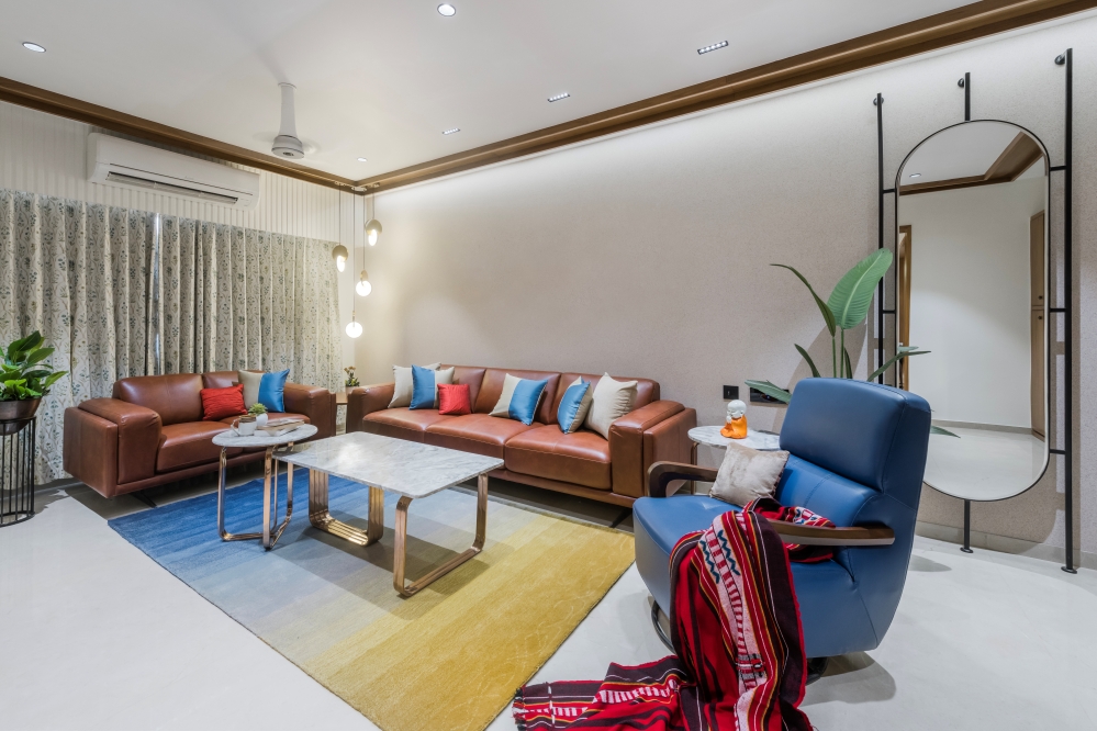
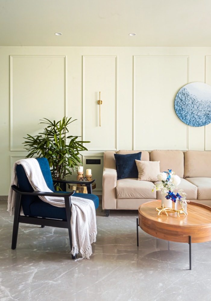
The living room has a long continuous wall which was panelled with pop mouldings and painted in a bluish grey tinge allowing it to become an understated backdrop for the furniture pieces. The in house custom designed shoe rack flanked by wall lights and art gives way to a bought out console cum bar unit topped with a wooden carved mirror reflecting the passage and the space beyond to add the illusion of length.


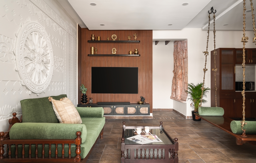
While the flooring and the ceiling were kept humble in design, the elemental additions have been done with restraint so as not to overpower the subtleness of the overall space. The fluted wooden panel and a simple black glossy Tv unit are accompanied by art showing a floating cloud in a bright blue sky duplicating the sense of lightness we wished to bring to the home. Art adds life to any space. It’s that final ingredient which makes the dish whole. We cannot imagine designing spaces without giving art its due place and importance.


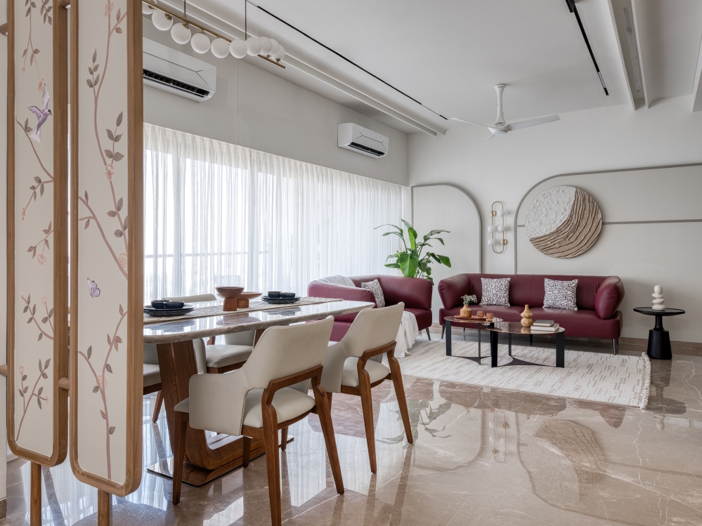
The dining space was conceptualized to add some textural play to the elemental designs. With grey, and wood brown as the primary players, the prints of the tiles, the irregularity of the terrazzo table top, the texture of the rattan sheet and the dining headboard fabric along with the colours of the vintage bird art all create a measured drama of layers.


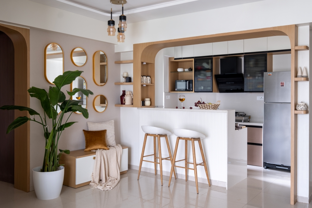
In terms of spatial realignment of the floor plan, we made 2 major changes in the layout. The first included the unused duct area beyond the kitchen to be taken in to make the kitchen larger. We divided the kitchen into the wet zone which contain the washing and drying activities and the dry area where the cooking and storage happen. The entry of the kitchen was modified and a sliding glass door added which allows privacy and visual access whenever needed.

The second change was to break the wall between the passage and the balcony taking in the balcony space and converting it into a work from home office. This alteration suddenly made the passage area visually lighter and brighter. As we look from the passage into the work from home space, we can’t help but appreciate the ample amount of light filtering in through the huge window and washing over the previously dark and dingy passage. This well designed home office space now becomes a motivation for our client to work from home successfully.


The mother’s room was homage to her love for nature. My love for prints is drizzled in here by the inclusion of floral wallpaper with birds perched on branches with flowers from the Payal Singhal collection of Marshalls wall coverings and the foliage art by Calcuttan gallery. These perfectly complement the base colours in grey and sea green. We also brought in the duct space in the mother’s room to make a walk in wardrobe accessible from the bedroom.


The spatial aesthetics for this home are all about continuity in elemental language, colours, textures and materials that create a uninterrupted spatial flow and visual expanse. Every design decision, material and colour choice has been derivative of this thought.


For the master bedroom, we continued with rattan sheets on wardrobe doors with wood and grey again forming the primary base. The wooden flute flanks the grey fabric headboard intersecting with an arched mirror. Since the husband was wary of floral and nature inspired prints, we went ahead with a checker wallpaper from Nilaya.


With ample light washing in through the window, this wallpaper becomes the piece de resistance of this otherwise simple and muted bedroom. But the true hero is the light which makes the space look expansive. Not shying away from colour with the addition of a royal blue curtain along with hints in the soft furnishings and the fabrics.


The washrooms are designed with terrazzo tiles accompanied by blue and ochre tiles that like the rest of the host stimulate with muted colour and pattern.

We have designed this home not to just add pomp and luxury but invite peace and quietude. Not a house with sensory overload but a home which allows you to listen to your own silent musings. Less is more here as we successfully balance the scales of various elements to create harmony.


The design of this house is an effort to be sensitive and responsive to all dimensions of body, mind and spirit. We will always strive to design with a sense of authenticity. Being true to our design aesthetics and the client’s requirements and choices will always be a tightrope we have learnt to walk with ease.
FACT FILE
Project Name : Bianca Residence
Design Studio : The Design Chapel
Principal Designer : Preshita Shah Gupta
Client’s Name : Vibhav and Arya Raut
Design Team : Preshita Shah Gupta, Kajal Kamath, Anjali Khandelwal, Tanvi Kirve
Project Location : Yari Road, Andheri West, Mumbai, India
Carpet Area : 1000 Sq. Ft.
Photography Credits : Biju Gopal, Bizou Photos
Interior Styling : Preshita Shah Gupta
Text Credits : Preshita Shah Gupta


