The Transitional Trio: A modern mix of classic and contemporary | AndSpaces | Pune
The term “transitional design” is often used to reflect a room’s meshing of modern and traditional elements — essentially, combining two styles in one space, resulting in a cohesive design.
Ar. Ankita Nand of AndSpaces and her team of designers incorporated modern-style interiors characterized by the terrific trio of blue, grey and white, clean lines and natural light in the overall design. Simplicity and use of textures, which is associated with contemporary interiors, was blended with the modern style. Space wasn’t considered a restriction but an element to be showcased by focusing on colour, form and scale. The furniture was a bespoke creation to reflect the style and personality of the owners. A successful transitional design style was achieved by seamlessly combining a mix of modern and traditional styles.

With that in mind, we opted for a style transitioning from modern to contemporary forms. Grey and blue are such a versatile combo. We could have a contrasting scheme or create a really cohesive look. Moreover, the introduction of white to this pallet brings in the chic look as and where required. Our timeless interior design coupled with the terrific trio gives the perfect balance with bright and soothing tones for this humble abode.
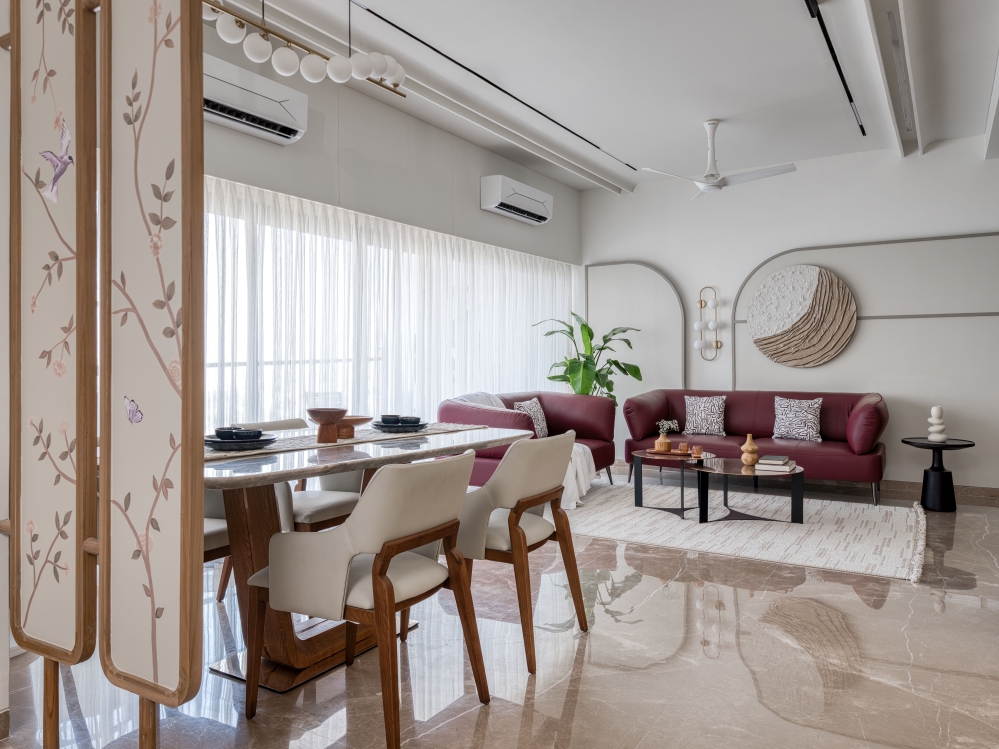
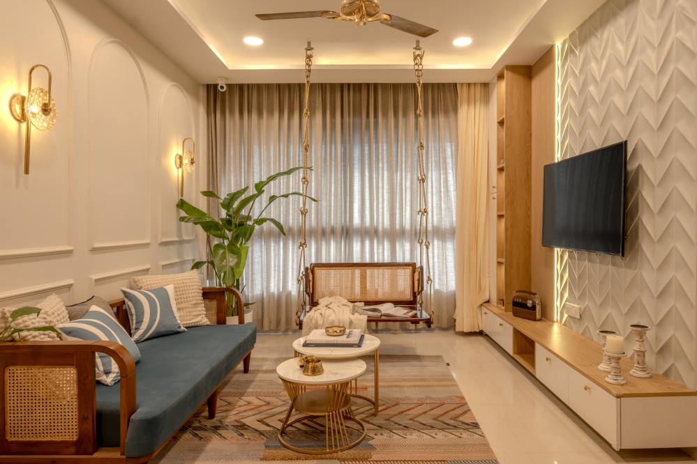
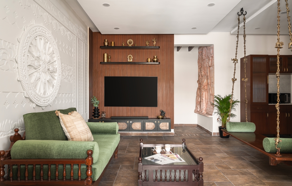
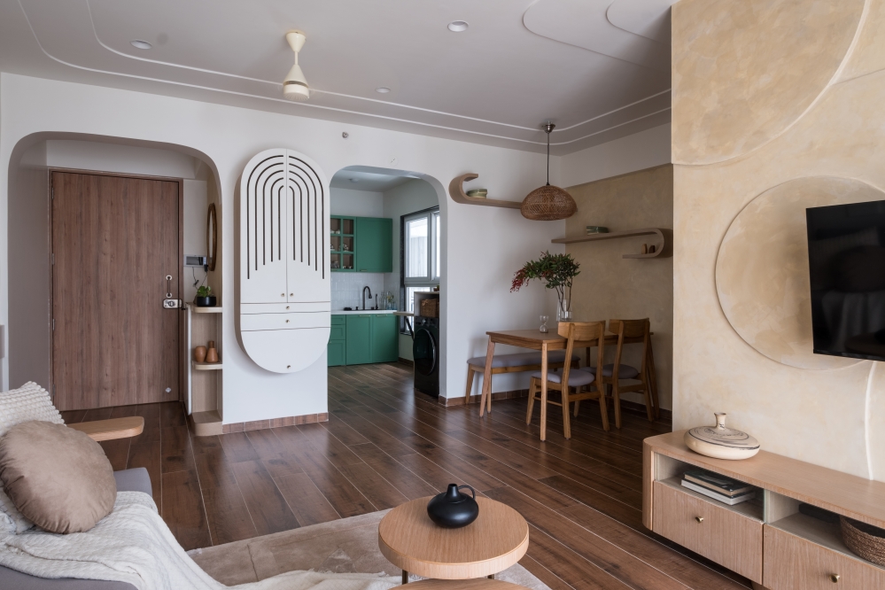
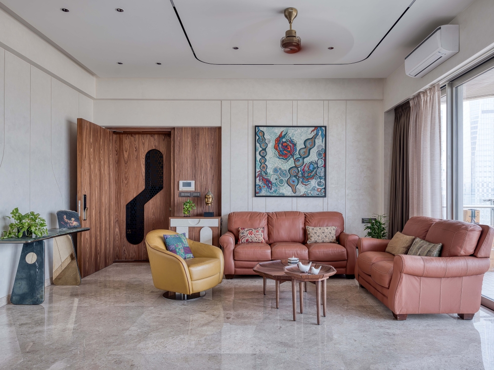
The entrance lobby and the living room have a calming and welcoming feel. The circles and arches with the clean-lined chairs and sofas, create a cohesive transitional room. The balcony attached to the living room is designed to provide a comfortable spot to relax after a long day. In the entrance lobby, a modern-style shoe rack doubles as a console unit. Spiral hanging lights and mirror panelling on the wall accentuates the space.


The overall theme of ‘The Transitional Trio’ prevails in this well-designed living room. The accent wall features circular niches with focus lights on the decorative items, making the entire wall a highlight. Next to it, is a simple Puja unit adding a divine aura to the space.

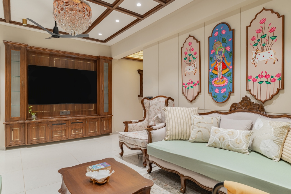
The Client brief suggested the use of modern design in the living room, and due to the design and area of the apartment, the only place available in the entire house for a mandir unit was the living room. With that in mind, a mandir design to fit in the modern interiors style was incorporated within the living room display wall.


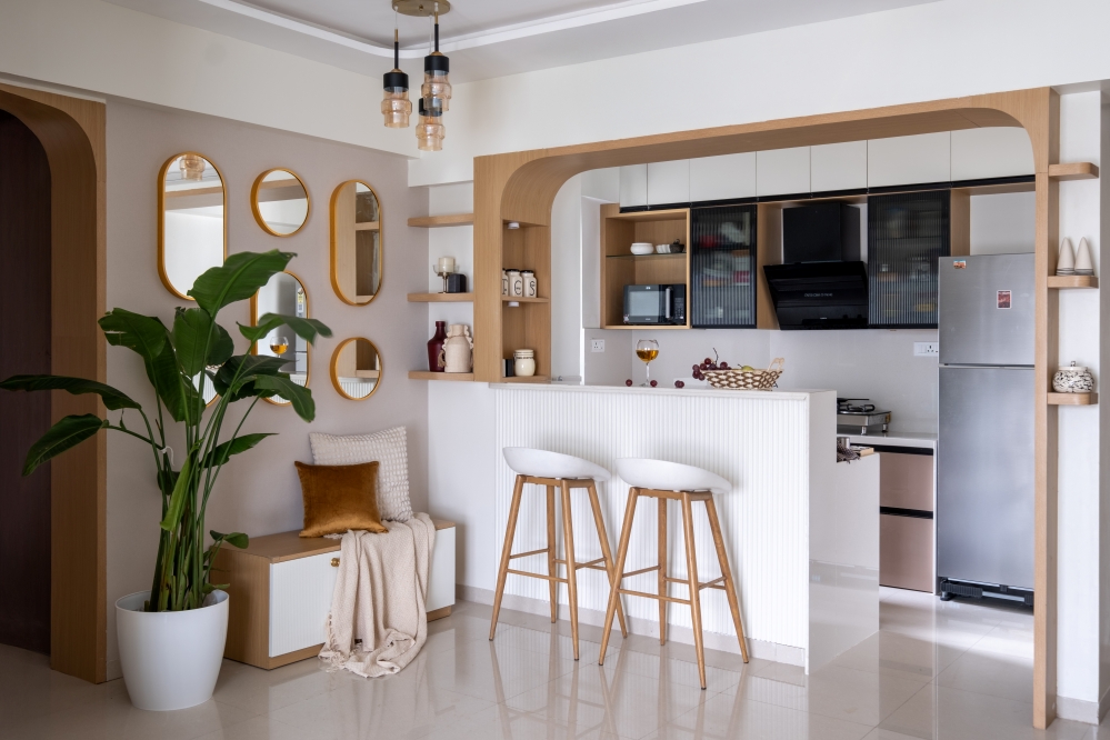
The L shaped modular kitchen ensures optimum utilization of space and looks sophisticated. With L shaped countertop and plenty of modular units to provide sufficient storage and to ensure optimum utilization of space. The quartz countertop and black acrylic shutters look refined and homogeneous with the theme. Mosaic tiles with different patterns in the dado area enhance the look of the entire kitchen.


The colour palette in the master bedroom as well as the kid’s bedroom is in line with the theme. The Jewel-tone Blue Scheme for the master bedroom and the marble tile inlay for the bed back wall create a luxurious colour combination that enhances the upscale feel. The master bedroom of this 2BHK, encompasses a huge wardrobe with navy blue duco finish shutters along with open shelves on the side to display artefacts. The queen size bed with a fabric headboard against the marble finish paneling looks luxurious.


The Kids bedroom is enlivened with neutral white walls solid blue and grey colors for a more dynamic look. This playful bedroom beautifully explores form, color and scale. The cerulean blue headboard becomes a focal point which is complemented by the storage with arch shaped niches. Throughout the design, the spatial and functional requirements have been catered to by a well-designed layout providing beds having elegant headboards, paneling, study desks and wardrobes with ample storage.


Our material pallet is simple and easy, continuing with the colour pallet of the terrific trio. Different textures according to the theme, including laminates, duco paints, marble tiles and the final touch with furniture by Viraaj by AndSpaces, creates a balanced look. The major constraint during the designing process was the efficient use of existing space. The client expected the design to incorporate maximum storage and furniture in every room without compromising on the aesthetics of the same.
The balcony with a super comfortable seating and plenty of greens is a perfect place to relax after a long day. The otherwise neutral color palette is infused with warmer browns for flooring and ceiling.

Majestique Towers stands apart as an architectural marvel. Elegantly handcrafted with intricate designs, Majestique Towers is not just another chip in the block—it is a haven that delivers an over-the-top experience to the chosen few livings here. The owners of this 800 sq. ft. 2BHK apartment in Pune wanted aesthetic, functional and cost-effective interiors. We identified a clear liking for circular forms and arches integrated with modern-style interiors, preferably without any wooden finishes throughout the design. The highlight of the project is the terrific combination of grey, blue and white. You can see a classic play of blue colour throughout the house. May it be the jewel-toned blue scheme for the master bedroom, or the nautical blue scheme for the living room, or the kids’ blue theme for the kid’s room. The balance between the three colours is the essence of the design in each space.
“Transitional interior design is a mixture of the traditional and modern styles. Bringing together pieces from various design styles creates a singular design that updates the classics with a cohesive, modern feel. It balances luxury with comfort, masculine with feminine, and antiques with new pieces.”
FACT FILE
Project Name : The Transitional Trio
Design Firm : AndSpaces
Principal Architects : Ar. Ankita Nand Deshmukh
Design Team : Prachi Rughani, Saloni Mugdiya, Apeksha Pathak, Sunil Kirodiwal
Project Area: 800 Sq. Ft
Project Location: Pune
Project Type : Residential Apartment Interior
Client : Mr. Ajay Shashikumar
Interior Styling : Sanjita Thakker
Photography Credits : Yamini Krishna Photography


