RISEOO Global Headquarters | Studio Meraki | Noida
Client Brief:
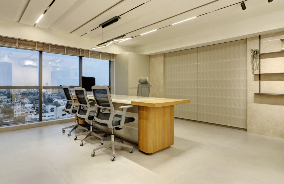
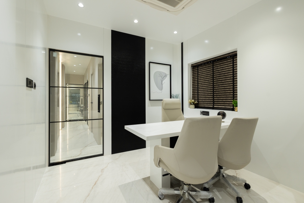
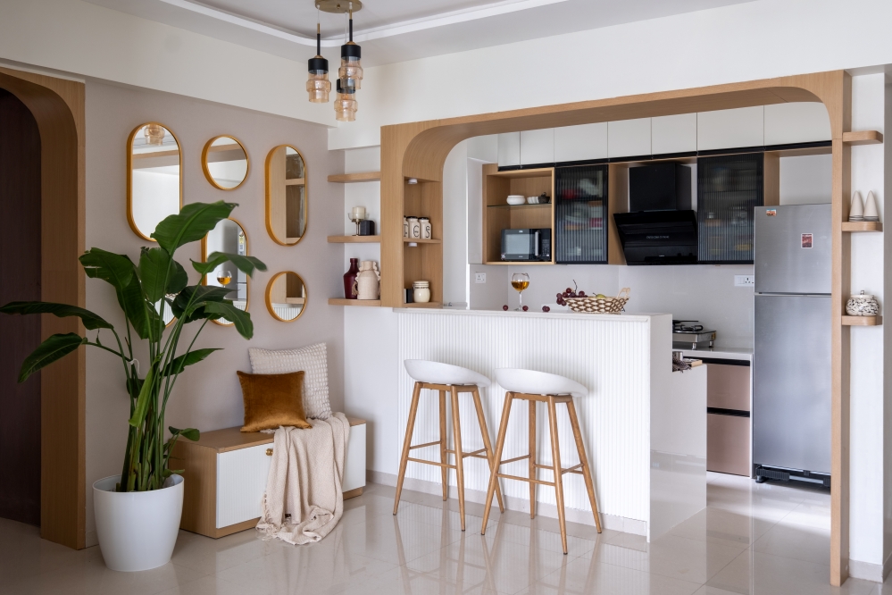
A Dubai based company RISEOO approached us with an intention to refurbish their newly leased office premises in India with smart and minimal interventions possible while maximizing the impact that could be done in their modest budget in coherence with their theme as well as the brand identity. The idea was to complement the already existing flooring and wall finishes with some contemporary furniture in such an adroit fashion that it could enforce their brand value to the customers as well become an eye-catching statement in the international arena as the second floor was totally dedicated to the marketing activities of their brand.


The interventions needed to be primarily in the form of state-of-the-art furniture, artwork, wall embellishments and signage. The design language was a pertinent tool to speak for the company and its representative logo that entwined their core concepts and ideologies.


Concept Note:
Keeping in mind the brief, the first ever conceptual sketch was done by us taking a single point reference from the logo of RISEOO. The two key impressions that we could gather instantly were the INFINITY loop and PHOENIX bird. These two representations therefore became the starting point for our design and were carried on comprehensively in the expressions of the furniture, wooden artworks, planters etc. as well as the compositions arriving out of them. Breaking down of the logo sculpted out a plethora of creative outcomes for this task and thereby the space structures were designed to have a unique identity of their own specifically for the brand and its exclusivity. Coming to the second important visual arena, the colour combination of purple and white stem out of the RISEOO logo again and become a primal theme for all the spaces.


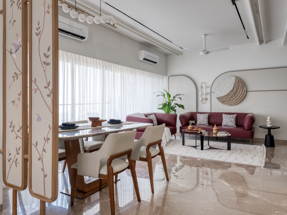
RISE in its symbolism is perfectly in sync with the rising curvature of the sofa back and the phoenix wing shaped table forms a reflection of a mirrored exquisite wooden artwork piece on the adjacent wall. All these thoughtful elements give the design its soul and the interior appeal a distinctiveness of its own that is akin to the brand RISEOO only. Due to the already existing grey carpet on all the floors, warmth and luminosity were added in forms of white and wooden/pine finishes at places. To break the excessive repetition of purple, white and grey, green walls along with metallic golden planters have been added that also offer respite in the work environment.


The sensitively crafted space compositions along with meticulous colour selections offer a dynamic space, fostering a connection between the employees and the brand. Also, each piece has a story of its own and a narrative that slowly unfolds as one experiences the space, immediately forming connections in the mind to RISEOO and its history.


FACT FILE
Project Name : RISEOO Global Headquarters
Design Firm : Studio Meraki
Design Team : Shweta Kaw, Naushaba, Rochi, Daljeet Singh
Client : Mr. Adlakha
Project Location : Noida
Project Completion : January 2022
Photography Credits : Suryan/Dang


