The TwinVin | Anupam Design Studio | Surat
In recent times, a new trend has evolved whereby emerging enterprises are complementing their office interiors in line with their professional ideologies to invigorate the working minds. The design brief for this office project by Anupam Design Studio presented an interesting challenge as the space was required to be configured for a working couple – Divya Vin, a homeopathic doctor and Nandish Vin, a chartered accountant. Both were keen on taking up the charge of their individual firms together, under the same roof. A shared office space, thus demanded an innate organization of spaces based on their adjacency, contiguity and overlap. However, it was crucial to segregate the individual private areas from the common areas to arrive upon an equitable design intervention that fulfilled the needs of both our clients.


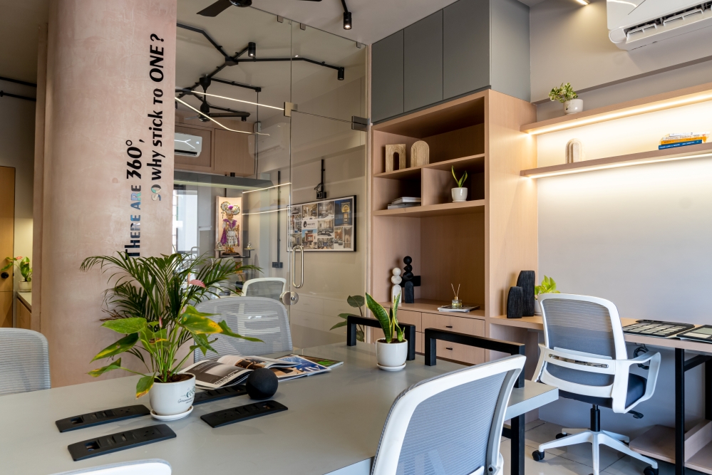
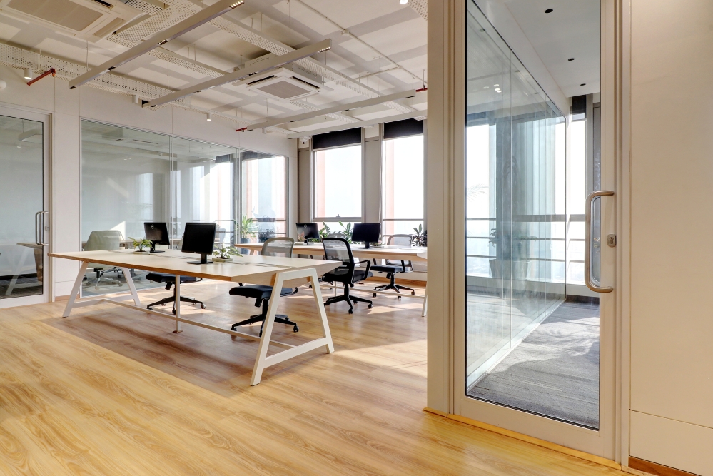
As soon as one enters the premises, he/she is received at a shared reception area that bisects into the two adjoining workspaces. This annex being the inception point also occupies a waiting lounge, a pantry and a washroom. At a first glimpse, the interiors reflect a blend of modern and minimalistic approach, characterized by simple and clean lines adding up to an uncluttered space. A monochromatic color palette with heather gray partitions and furniture is accentuated by the tow-coloured flooring that runs throughout the office.


The exposed ceiling paired with open conduits serves as another practical yet creative intervention of doing away with conventional flat false ceilings and allowing the room more volume. The choice of accommodating the presentation room and the services near the entrance was for the ease of logistics. Each of the two offices are accessed by dedicated entries following a language similar to the walls. The door on the right leads to Divya’s clinic and the one on the left to Nandish’s office.


As we move in, the two offices are visually segregated using a set of colors specifically governed by the type of service it houses and the needs of the users in each space. The palette for the homeopathic clinic as it should allure a sense of comfort and healing, meanders between the shades of gray, teal blue and a glimpse of saddle brown to keep the overall interior serene and subtle. Lighting is factored as another important aspect of the design.


The lighting in the waiting area is less bright to evoke a sense of calmness and remedy while the consultation room is comparatively brighter. The furniture of the waiting room follows a rhythmic stripped pattern, subjected to custom made seating attached on the opposite faces and is coloured in such a way that it contrasts well with the walls and flooring Complementary to its counterpart, the palette for the CA’s work station is brightened by the contrasting colors similar to that of the flooring, to engage its employees and enhance their productivity.

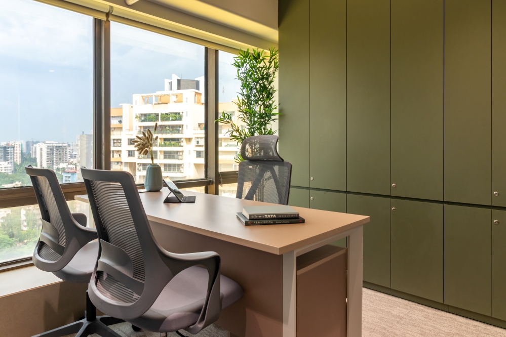
The partition walls along the passage smartly infuse the provision of tack boards into its tactile pattern and is visually connected to each space through the glass partitions. The two executive cabins are cordoned off in glass walls towards the toe end, tucked into the corners of their respective offices to achieve the intended privacy while also maintaining the visual connection and overall transparency with areas that are more free-flowing and spill over into each other. The executives’ desks with a dark countertop synchronized with the chairs, contrasted with the bright yellow flooring – all of which are sitting on a monochromatic backdrop, generating a remarkable visual experience.


An interesting feature of the program is the addition of the library cum reading room for their children. It is designed as an accessory to Divya’s cabin so as to engross with their kids during the break time, while still at work. Plain gray finishes, complemented by glass-faceted cabinets and vibrant coloured tack boards give the read a rich and elegant finish. Whether it’s the expansive windows to capture natural daylight or solid partitions or sleek furniture or dramatic use of alcoves and niches to accent sculptures or murals or art pieces on the walls, “layers” have been created to fashion a stunning experience of “chromatic indulgence”. This characteristic is further exploited in the minute details such as crafted door handles of the pharmacy store, adorned over plain glass doors to achieve a monolithic look.


The spectrum of design thus evolved to be more agile and innovative to fit into the desired business model. The overall idea was to tenor the space into a contemporary theme using neutral color tones and local materials.


FACT FILE
Project Name : The TwinVin
Design Firm : Anupam Design Studio
Project Location : Surat, Gujarat
Project Type : Commercial
Photography Credits : Pratikruti Photography
